Gallery 3: Working with Sheets
This page provides examples on:
2D and 3D plotting in plan view
Extracting and plotting maximum statistics
Plotting the difference between existing and developed conditions
Exporting of ASCII Arc Grids
Saving plots to disk
This notebook is used in combination with the TUFLOW FV Python Toolbox (tfv) package. To follow along on your own computer, please download the demonstration notebooks from the TUFLOW Downloads Page. Look for the TUFLOW FV Python Toolbox download. Installation instructions are provided on our TUFLOW FV Python Toolbox Wiki Page.
import xarray as xr  # We utilise xarray to do all the heavy lifting
import tfv.xarray
from pathlib import Path # We'll also make use of the `pathlib` module to assist with managing file-paths, although this is entirely optional!
import matplotlib.pyplot as plt
Open TUFLOW FV Model Result
model_folder = Path(r'..\..\data')
model_file = 'HYD_002.nc'

fv = xr.open_dataset(model_folder / model_file, decode_times=False).tfv
# fv  # Uncomment this if you want to review the contents of the Dataframe
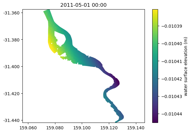
Single Sheet Plot
# Quick plot - first time step of first variable
fv.plot()
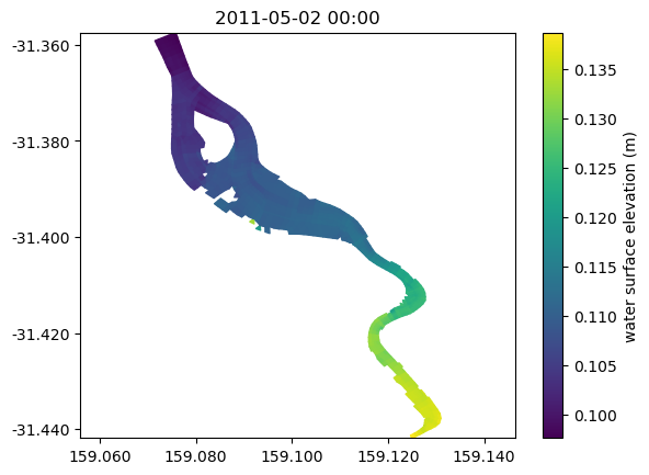
# Plot at variable at a particular time
ts = '2011-05-02 00:00'
fv.plot('H', ts)
<tfv.visual.SheetPatch at 0x1c4ace5c150>
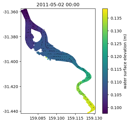
Sheet Plot With Vectors and Save to Disk
# Plot a variable at a particular time with vectors
ts = '2011-05-02 00:00'

# Add figure and axes
fig, ax = plt.subplots()

# Common settings
ax.set_aspect('equal')

fv.plot('H',ts, ax=ax)
fv.plot_vector('V', ts, ax=ax, color='k')   # We can plot a vector overlay using the `plot_vector` method here. This plot uses depth averaged vectors however you can use the datum and limits variable to change this.

# Save to disk
plt.savefig(Path('./plots') / 'Example_Sheet.jpg', dpi=300)
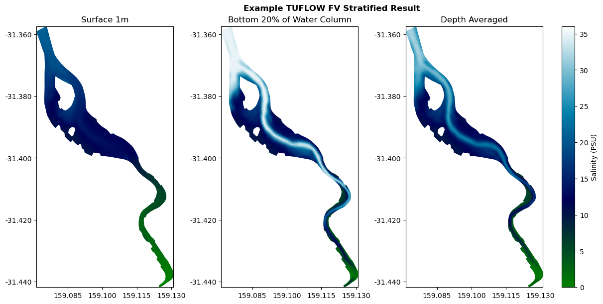
Sheet Plot at Different Depths
ts = '2011-05-02 00:00'
fig, axes = plt.subplots(ncols=3, figsize=(12, 6), constrained_layout=True)

sal_spec = dict(cmap='ocean', clim=(0, 36), shading='interp', colorbar=False)

ax = axes[0]
p1 = fv.plot('SAL', ts, ax=ax,  datum='depth', limits=(0,1), **sal_spec)  # By setting datum to depth, this is now the "surface 1m")
ax.set_title('Surface 1m')

ax = axes[1]
p2 = fv.plot('SAL', ts, ax=ax, datum='sigma', limits=(0,0.2), **sal_spec)
ax.set_title('Bottom 20% of Water Column')

ax = axes[2]
p3 = fv.plot('SAL', ts, ax=ax, **sal_spec)
plt.colorbar(p3.patch, ax=ax, orientation='vertical',label='Salinity (PSU)')
ax.set_title('Depth Averaged')

fig.suptitle('Example TUFLOW FV Stratified Result', fontweight='bold', x=0.55)
titles = {0: 'Velocity', 1: 'Salinity', 2: 'Temperature'}
Save Sheet To ASCII Arc Grid
ts = '2011-05-02 00:00'
cell_size =  5*10**-5
data = fv.xtr.get_sheet_cell('V', ts, datum='depth', limits=(0,1))

out_ascii = Path('./outputs') / 'Surface_V_2011-05-02.asc'
fv.xtr.write_data_to_ascii(out_ascii, data, cell_size)
Extract Grid From Sheet And Output To GeoTiff
This example shows how to write a sheet to a custom grid resolution and extent using the get_sheet_grid method. A raster is then output to geotiff using the rioxarray package. Please note that RioXarray is not a requirement of the tfv package and must be installed separately via: conda install -c conda-forge rioxarray. This install may take several minutes flexibly solve in your tfv-workspace environment.
The get_sheet_method can be used to convert your TUFLOW FV mesh results to a regular grid. This may be useful if you need to compare TUFLOW FV results from different computational meshes, or if you need to compare a TUFLOW FV result with a data raster. For example, a DEM of surveyed bathmetry verses TUFLOW FV bed elevation outputs.
RioXarray is a wrapper around the rasterio package that allows for easy rasterio integration with xarray. It is a very powerful package that allows for the easy export of xarray data to a variety of formats.
import rioxarray  # Note this is not a dependency of tfv and you will need to install seperately (see above).

# Define output path
opath = Path('./outputs') / 'raster_geotiff.tif'

# Define bounding box [xmin, ymin, xmax, ymax]
bbox = [159.08597, -31.39684, 159.09753, -31.3877]

# Extract the TUFLOW FV results to a regular grid. This example extracts a single timestep, however the default it for all timesteps.
grd = fv.get_sheet_grid(time='2011-05-02 00:00',dx=0.00005, dy=0.00005, bbox=bbox)

# Ouptut salinity to geotiff
grd['SAL'].rio.to_raster(opath)
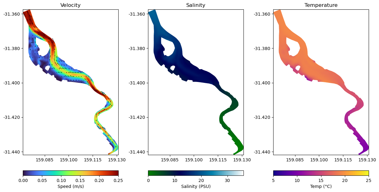
Multiple Sheet Plots
%matplotlib inline
# With datum='depth', this is the surface 1m.
# Experiment with datum='height' to see how the results change.
datum = 'depth'
limits = (0,1)

fig, axes = plt.subplots(ncols=3, figsize=(12, 6), constrained_layout=True)

ts = '2011-05-02 00:00'

ax = axes[0]
p1 = fv.plot('V', ts, ax=ax,  shading='interp', cmap='turbo', clim=(0, 0.25), datum=datum, limits=limits, colorbar=False)  # By setting datum to depth, this is now the "surface 1m")
v1 = fv.plot_vector('V', ts, ax=ax, color='k')   # We can plot a vector overlay using the `plot_vector` method here
ax.set_title('Velocity')
plt.colorbar(p1.patch, ax=ax, orientation='horizontal', label='Speed (m/s)')

ax = axes[1]
p2 = fv.plot('SAL', ts, ax=ax,  shading='interp', cmap='ocean', clim=(0, 36), datum=datum, limits=limits, colorbar=False)
ax.set_title('Salinity')
plt.colorbar(p2.patch, ax=ax, orientation='horizontal', label='Salinity (PSU)')

ax = axes[2]
p3 = fv.plot('TEMP', ts, ax=ax, shading='interp', cmap='plasma', clim=(5, 25), datum=datum, limits=limits, colorbar=False)
ax.set_title('Temperature')
plt.colorbar(p3.patch, ax=ax, orientation='horizontal', label='Temp (°C)')
<matplotlib.colorbar.Colorbar at 0x1c4afa9bc10>
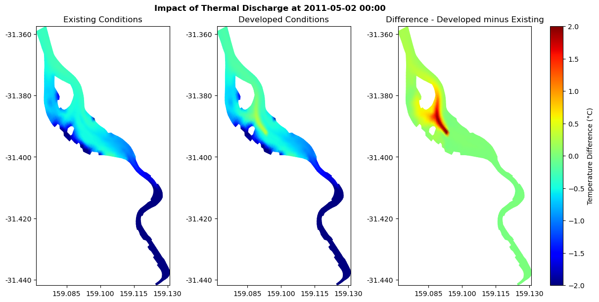
Impact Sheet Multiple Models
# Open second set of results. This model has a 40 degree celcius thermal discharge in the surface 1m.
model_file = 'HYD_002'
model_file_therm = 'HYD_002_Thermal_Discharge.nc'

# Open file
fv_therm = xr.open_dataset(model_folder / model_file_therm, decode_times=False).tfv

# Subtracting based on the 3D RAW DATA
fv_therm['IMPACT'] = fv_therm['TEMP'] - fv['TEMP']

ts = '2011-05-02 00:00'
fig, axes = plt.subplots(ncols=3, figsize=(12, 6), constrained_layout=True)

temp_spec = dict(cmap='jet', clim=(15, 25), shading='interp', colorbar=False)
diff_spec = dict(cmap='jet', clim=(-2, 2), shading='interp', colorbar=False)

ax = axes[0]
p1 = fv.plot('TEMP', ts, ax=ax,  datum='depth', limits=(0,1), **temp_spec)  # By setting datum to depth, this is now the "surface 1m")
ax.set_title('Existing Conditions')

ax = axes[1]
p2 = fv_therm.plot('TEMP', ts, ax=ax, datum='depth', limits=(0,1.0), **temp_spec)
ax.set_title('Developed Conditions')

ax = axes[2]
p3 = fv_therm.plot('IMPACT', ts, ax=ax, datum='depth', limits=(0,1.0), **diff_spec)
plt.colorbar(p3.patch, ax=ax, orientation='vertical',label='Temperature Difference (°C)')
ax.set_title('Difference - Developed minus Existing')

fig.suptitle('Impact of Thermal Discharge at ' + ts, fontweight='bold', x=0.45)
titles = {0: 'Existing Conditions', 1: 'Developed Conditions', 2: 'Impact'}
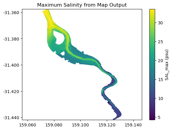
Plot Sheet Max
fv.get_statistics('max', 'SAL', datum='sigma').plot()
plt.title('Maximum Salinity from Map Output')
Text(0.5, 1.0, 'Maximum Salinity from Map Output')
Save Max to asc
import numpy as np

stat_max = fv.get_statistics('max', 'SAL', datum='sigma')
cell_size =  5*10**-5

out_ascii = Path('./outputs') / 'Max_Depth_Ave_Salinity.asc'
fv.xtr.write_data_to_ascii(out_ascii, np.squeeze(stat_max['SAL_max']), cell_size)
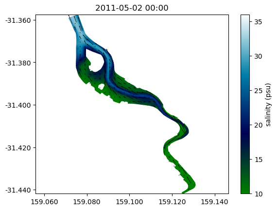
Save Sheet Plot Animation
To save an animation it is required to have the FFmpeg program on your computer’s Path environment variable.
out_file = Path('./outputs') / 'Salinty_Animation.mp4'
from matplotlib import animation
time_start = '2011-05-02 00:00'
time_end = '2011-05-02 12:00'

fvx = fv.sel(Time=slice(time_start, time_end))

# Colour settings
col_spec = dict(cmap='ocean', clim=(10, 36), shading='interp', edgecolor='face')

# Vector settings
vec_spec = dict(angles='uv', scale_units='dots', scale=1/200, width=0.002,
                headwidth=2.5, headlength=4, pivot='middle', minlength=2)

variable = 'SAL'
vector_variable = 'V'

fig, ax = plt.subplots()
ax.set_aspect('equal', adjustable='datalim')

sheet = fvx.plot(variable, 1, ax=ax, **col_spec)
vec = fvx.plot_vector(vector_variable, 1, ax=ax, **vec_spec)

def animate(i):
    sheet.set_time_current(i)
    vec.set_time_current(i)
    date = sheet.get_time_current()
    ax.set_title(date.strftime('%Y-%m-%d %H:%M'))

nframes = fvx.dims['Time']
anim = animation.FuncAnimation(fig, animate, frames=nframes, repeat=False)
anim.save(
    out_file,
    writer=animation.FFMpegWriter(),
    dpi=300)
Interactive Sheet Plot
%matplotlib widget

fv.plot_interactive('V', cmap='turbo', clim=(0,0.5), datum='depth', vectors=True)
plt.show()
This concludes the examples on sheet plotting.